Co-op Midcounties
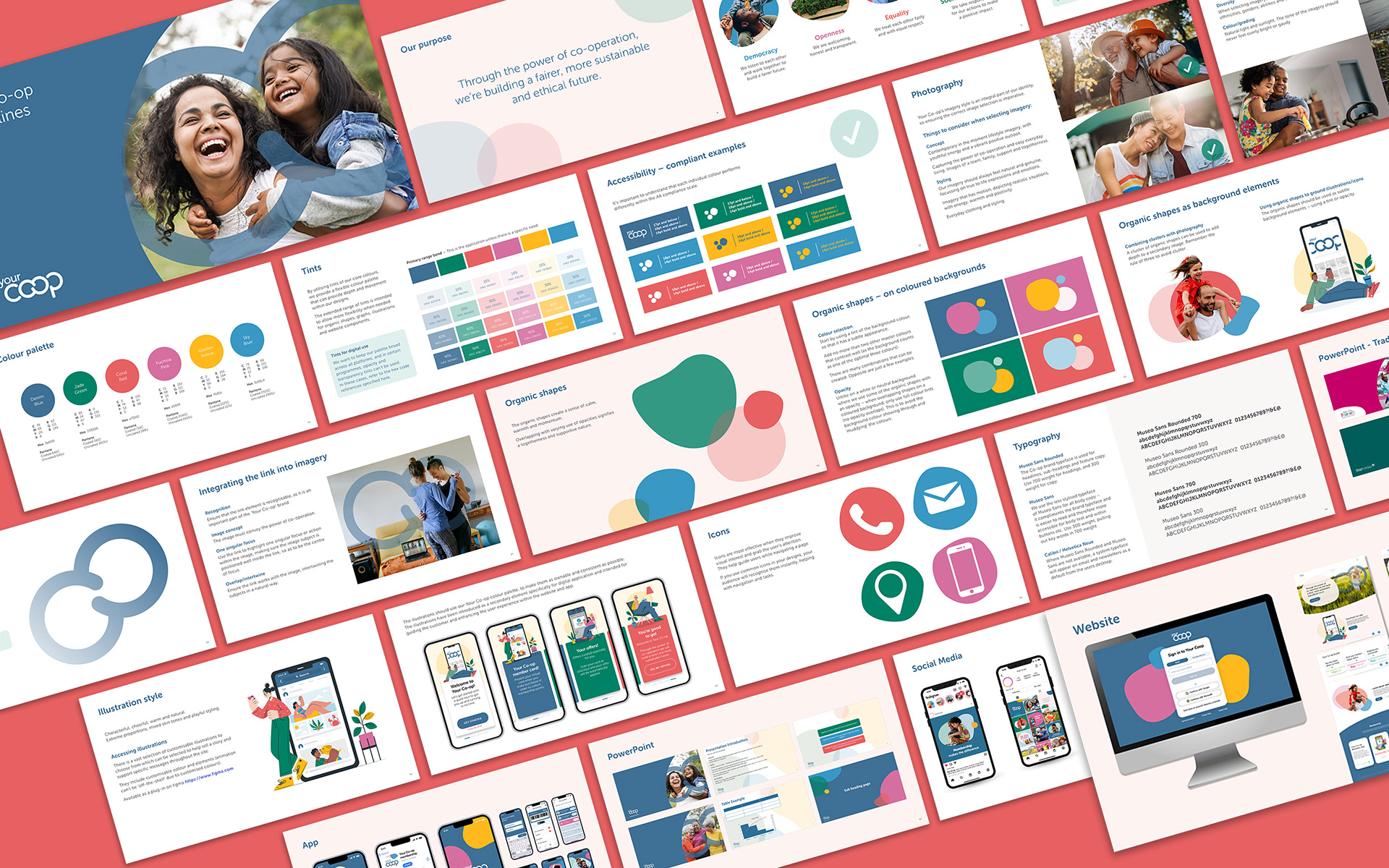
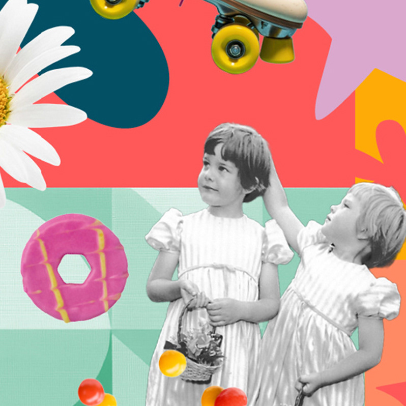
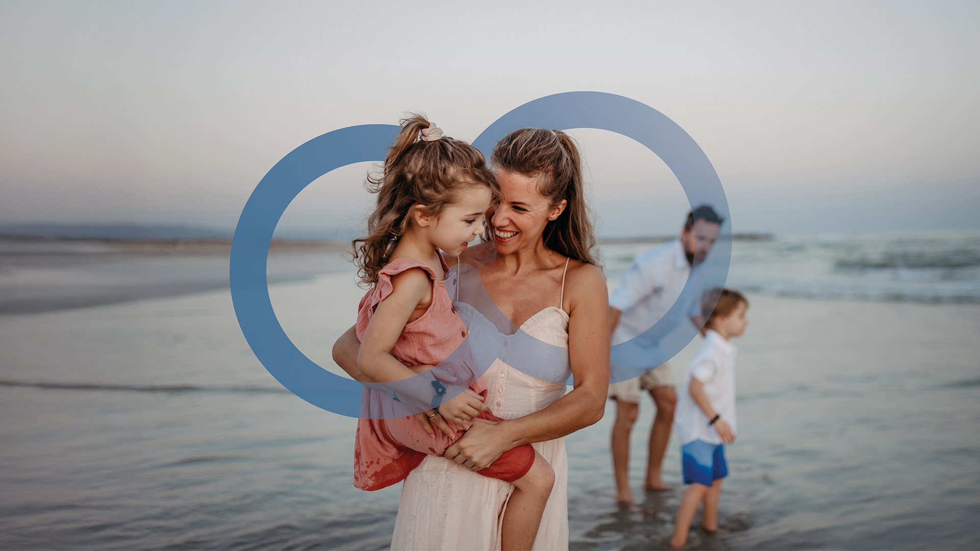
A rebrand for Co-op Midcounties that began with an in-depth review of the colour palette, rebuilding it to be AA compliant for digital use while better reflecting the organisation’s diverse and inclusive cooperative values.
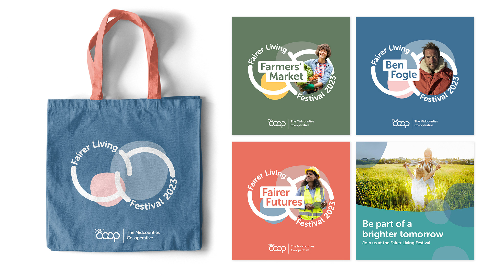
As the work developed, it became clear the brand needed a clearer system – one flexible enough to span the breadth of services under the Midcounties umbrella, from childcare and food to travel and energy. The resulting identity brought consistency across sectors, whilst allowing each to feel distinct.
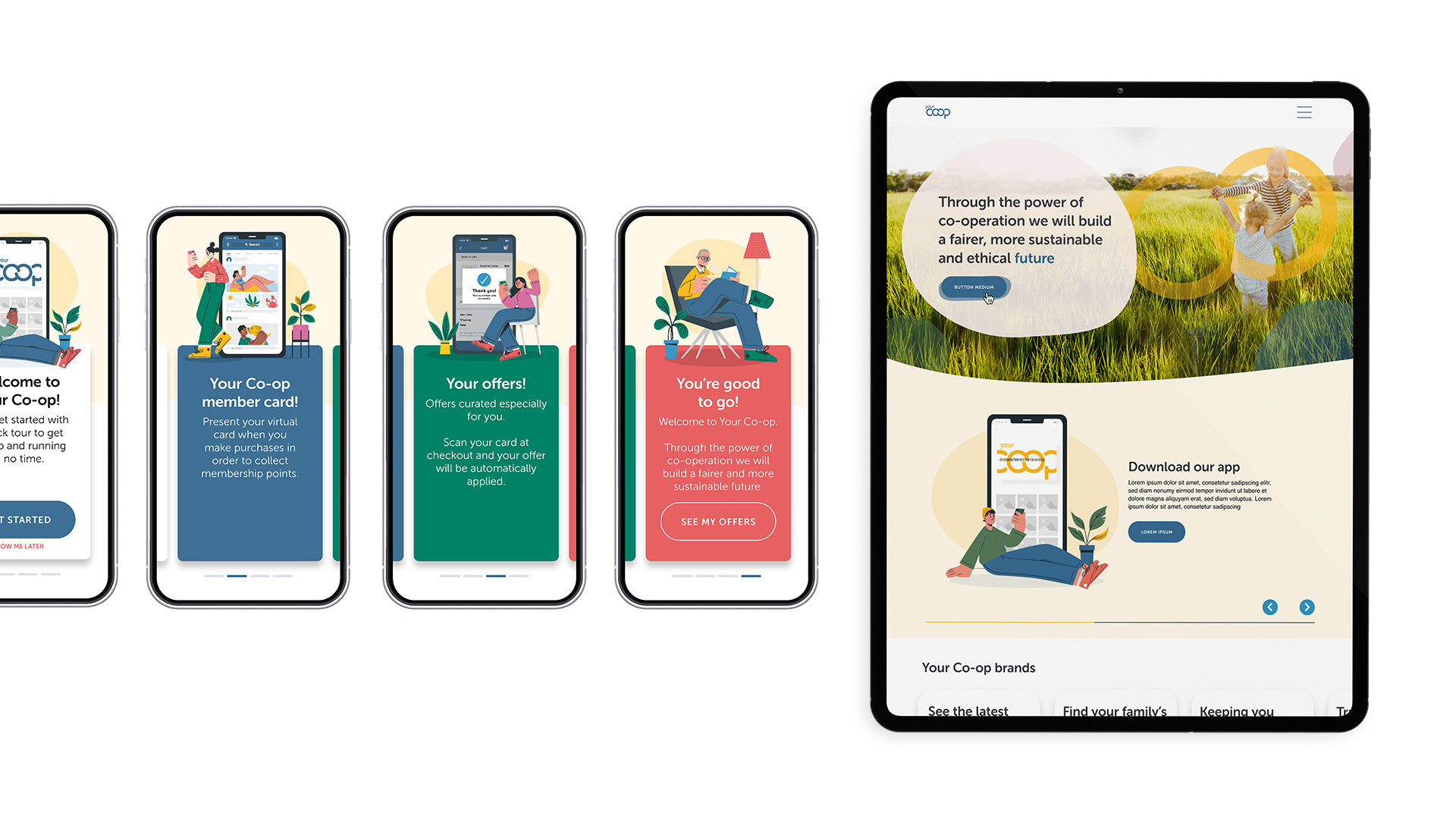
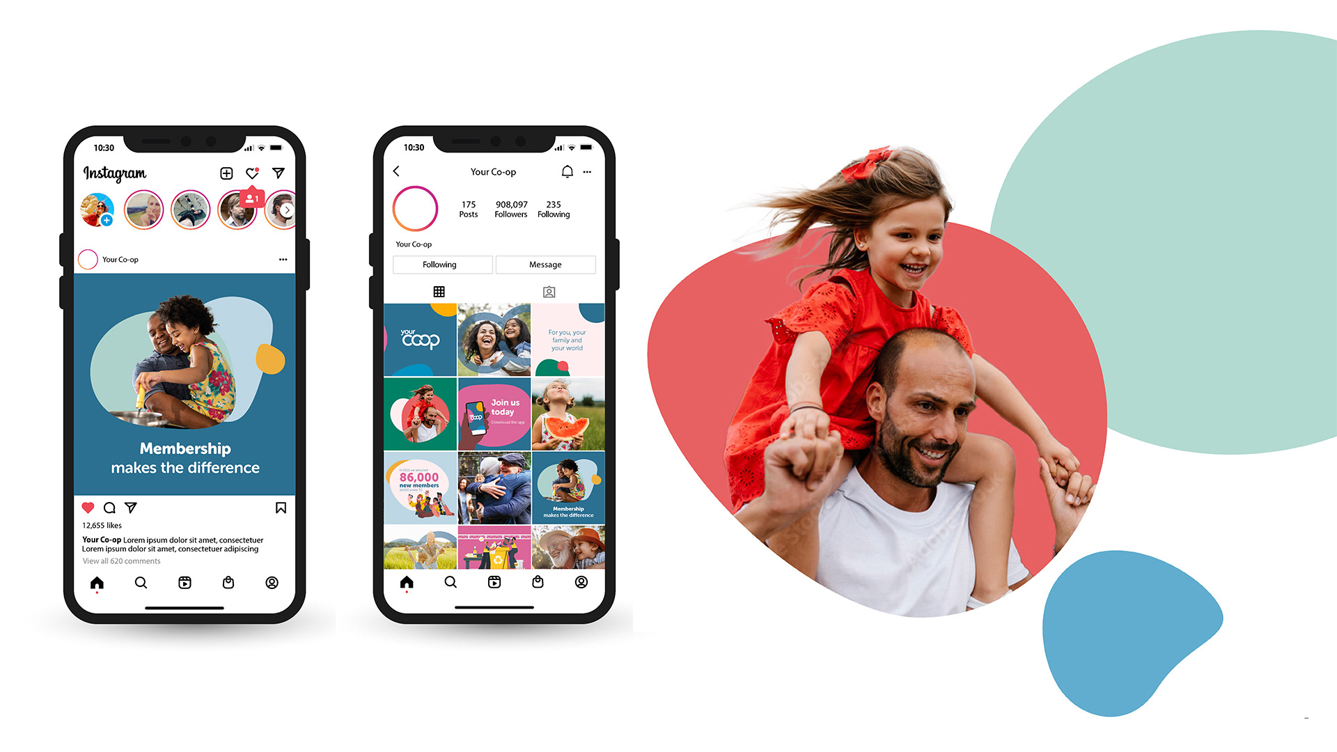
An inclusive ethos was expressed through imagery of groups and supported by clusters of organic graphic shapes. Illustration was introduced to help guide users through more functional onboarding and membership journeys. The work evolved well beyond its starting point, and its impact continues to shape the brand today.
Created with the brilliant team at palmerhargreaves.co.uk