Becky M Celebrant
A joyful branding project for a truly energetic, all-the-vibes client. Becky has a clear voice, offering weddings, celebrations of life and naming ceremonies – but deliberately with a real difference. Celebrating life in full colour: because life isn’t tidy. It’s loud, complicated and brilliant – and the brand had to reflect that.
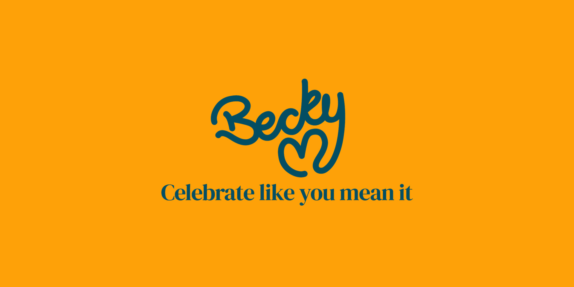
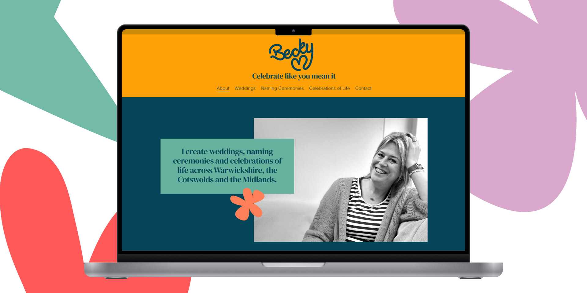
The logo is hand-drawn – there’s only one Becky, so it had to be unique. The ‘M’ forms a heart, encapsulating life, love and soul. The palette is intentionally bold and bright, standing apart from the industry’s cliché expectations.
If you have something (or someone) to celebrate, check out beckymcelebrant.com
This collage direction is inspired by Becky’s role in people’s most significant moments – holding memory, celebration and reflection all at once. Collage felt like a natural expression, combining photographs with objects that reflect memory and personality. It also introduces a subtle imperfection, reinforcing the honesty at the heart of what she does.
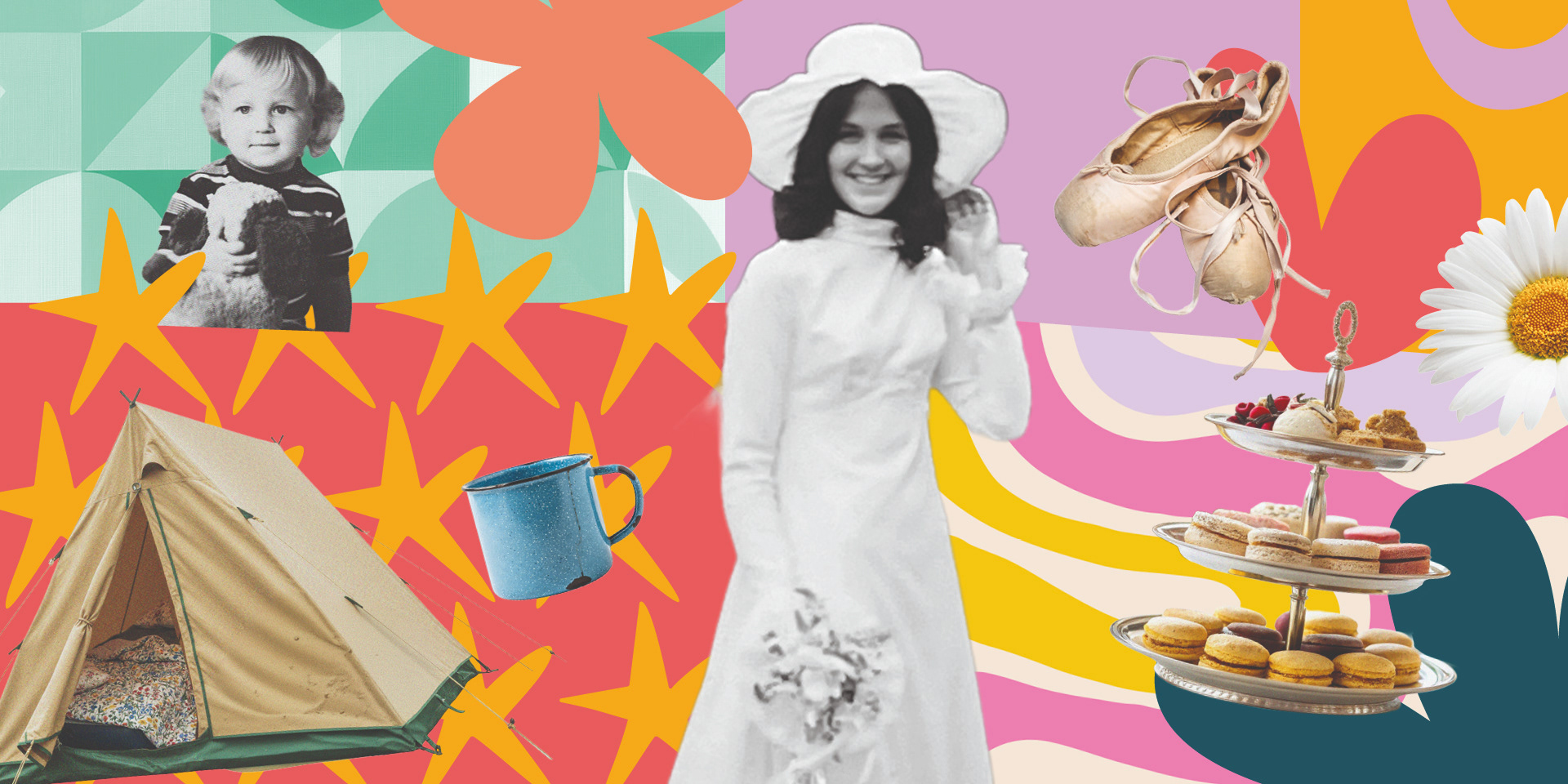
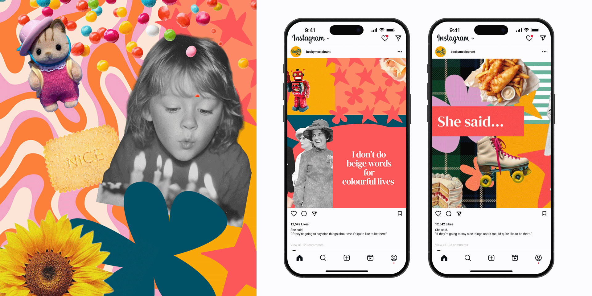
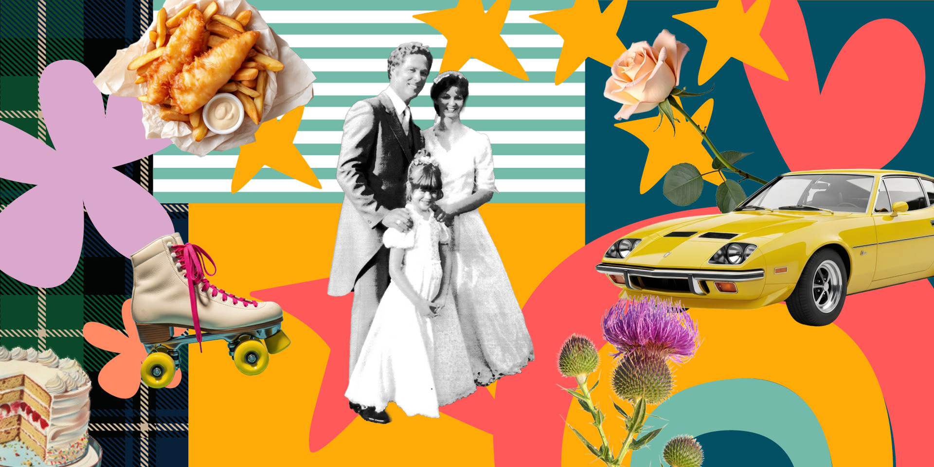
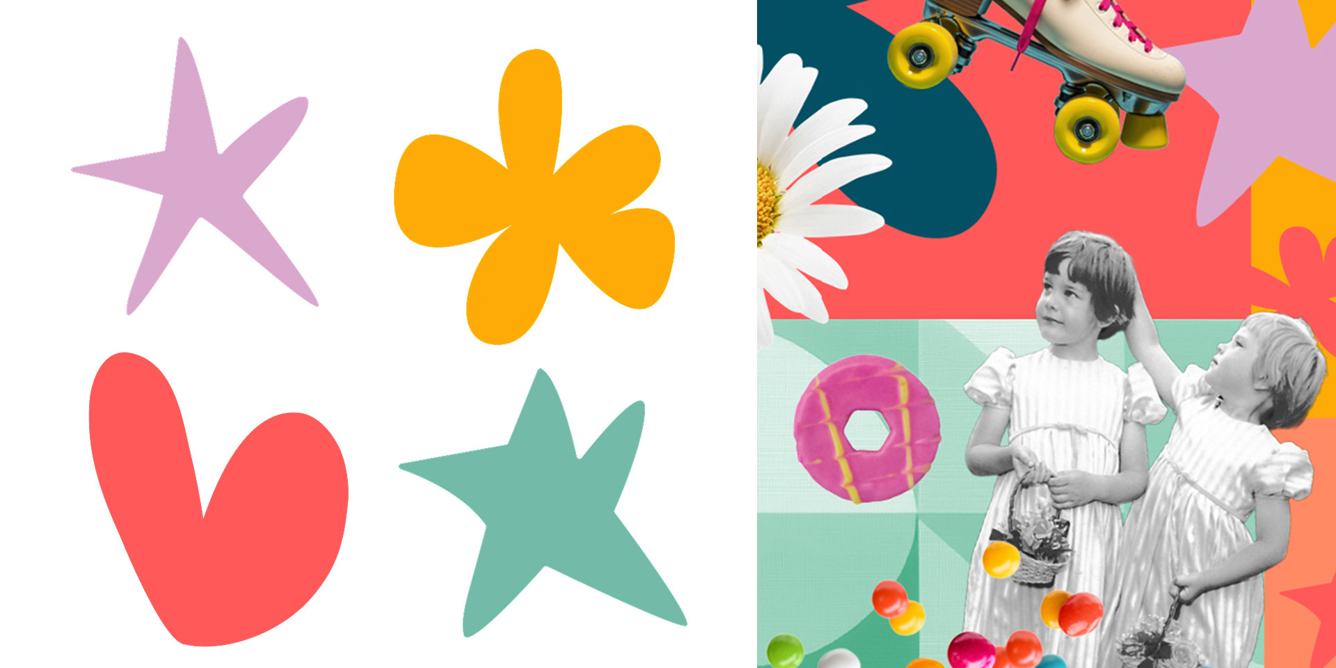
The supporting illustration style is a bespoke set of organic shapes that echo the logo’s slightly bendy movement, avoiding anything too rigid or traditional.
There’s also a subtle nod to the Kiki/Bouba effect – some shapes softer and rounder, others sharper and more energetic – adding warmth, spontaneity and personality.