Deborah Harman Nutrition
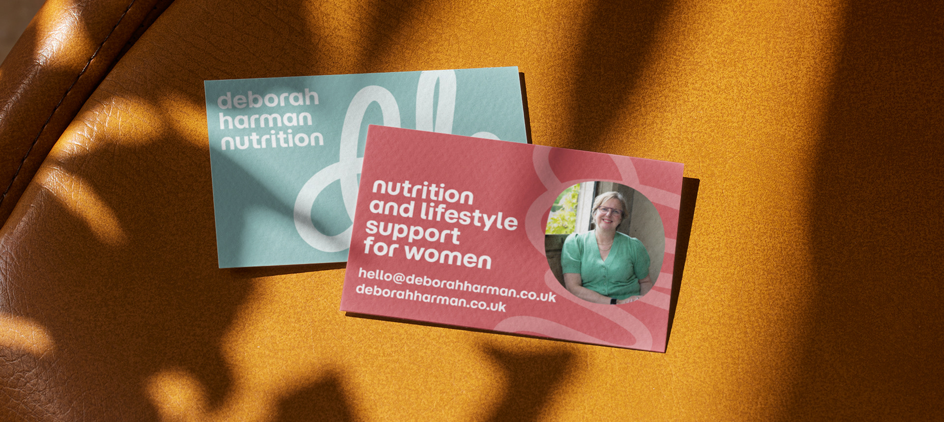
A thoughtful branding project for Deborah Harman Nutrition, creating a warm and approachable identity for a nutritionist who wants to make conversations around food, health and wellbeing feel a little less clinical and more like a warm hug.
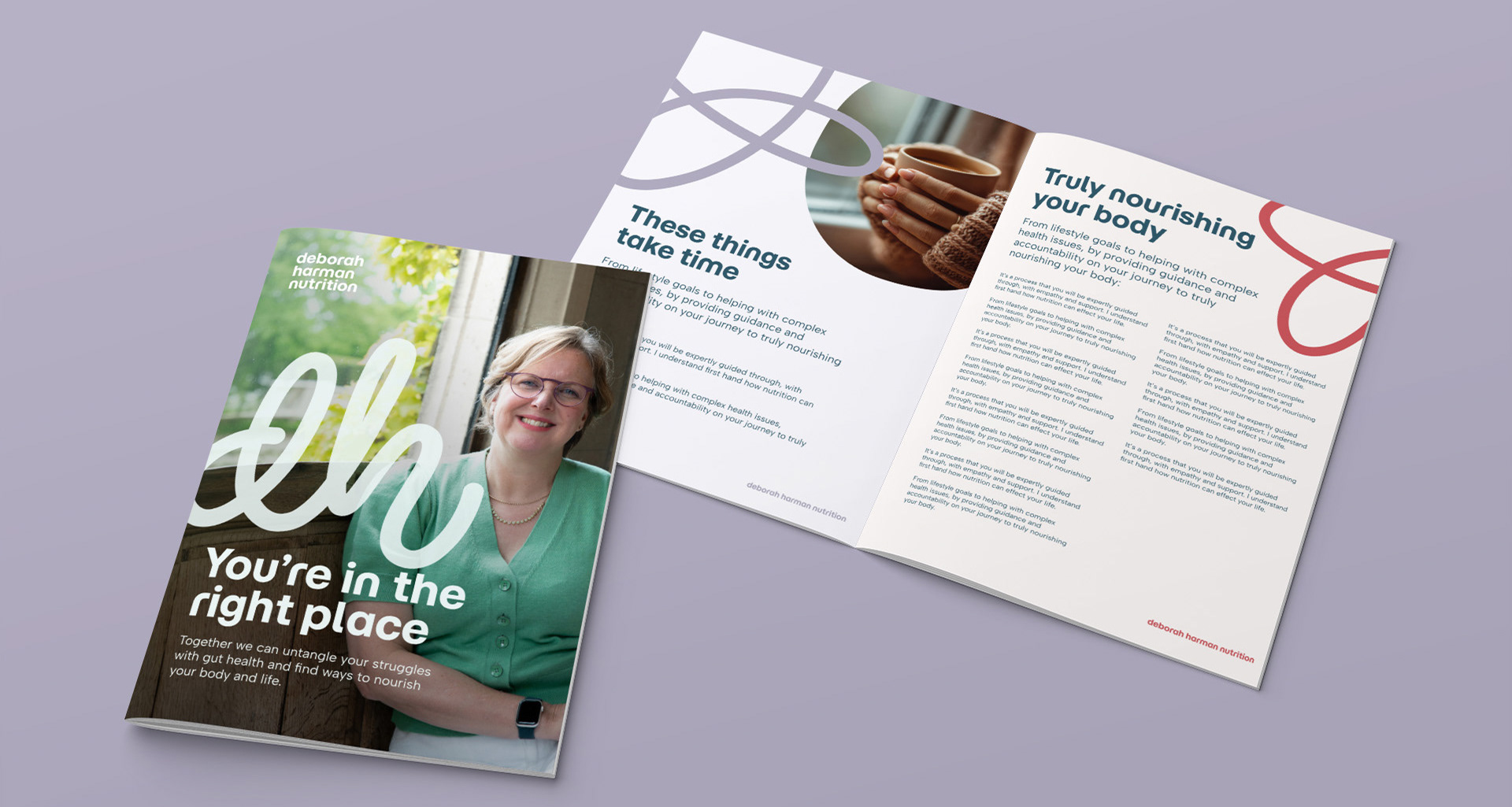
The brand needed to communicate Deborah’s knowledge and professionalism, while still feeling personal, welcoming and true to her approach. The identity brings these things together through a soft, considered colour palette, organic shapes, friendly typography and a hand-drawn squiggle that became a key part of the visual language.


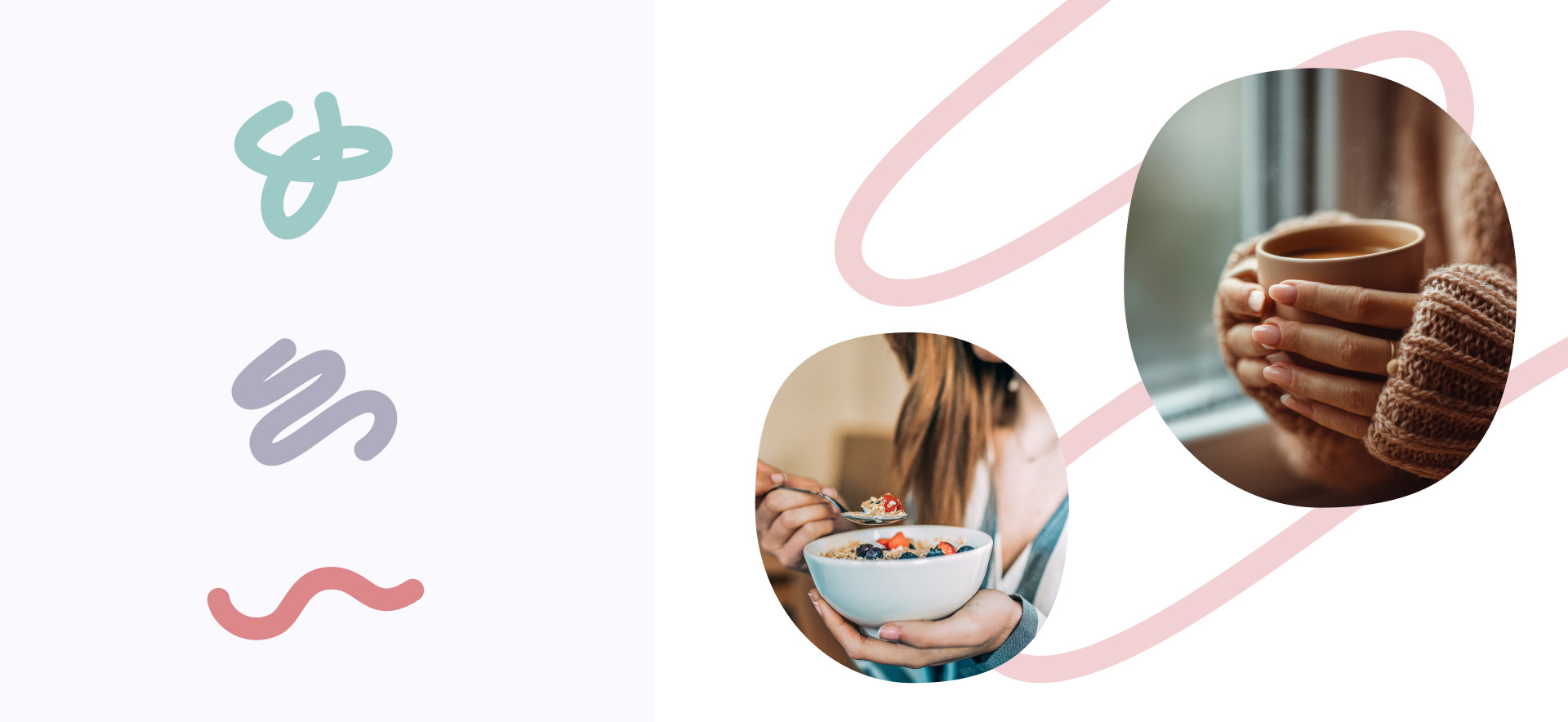
The squiggle became one of the most distinctive elements of the identity, inspired by the twists and turns of the digestive journey. Its slightly imperfect, hand-drawn quality brings movement and personality to the brand, while giving the identity something recognisable to carry across different applications.
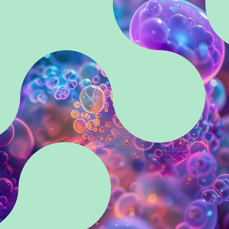
Alongside it, a collection of soft, organic shapes helps to create a visual language that feels natural rather than overly structured. They can be used to frame photography, create interest within layouts or simply add a little movement to the more informative parts of the brand.

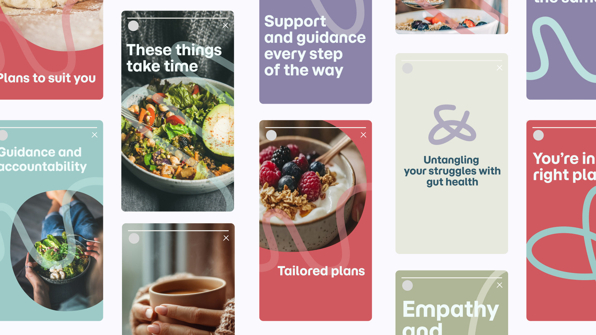
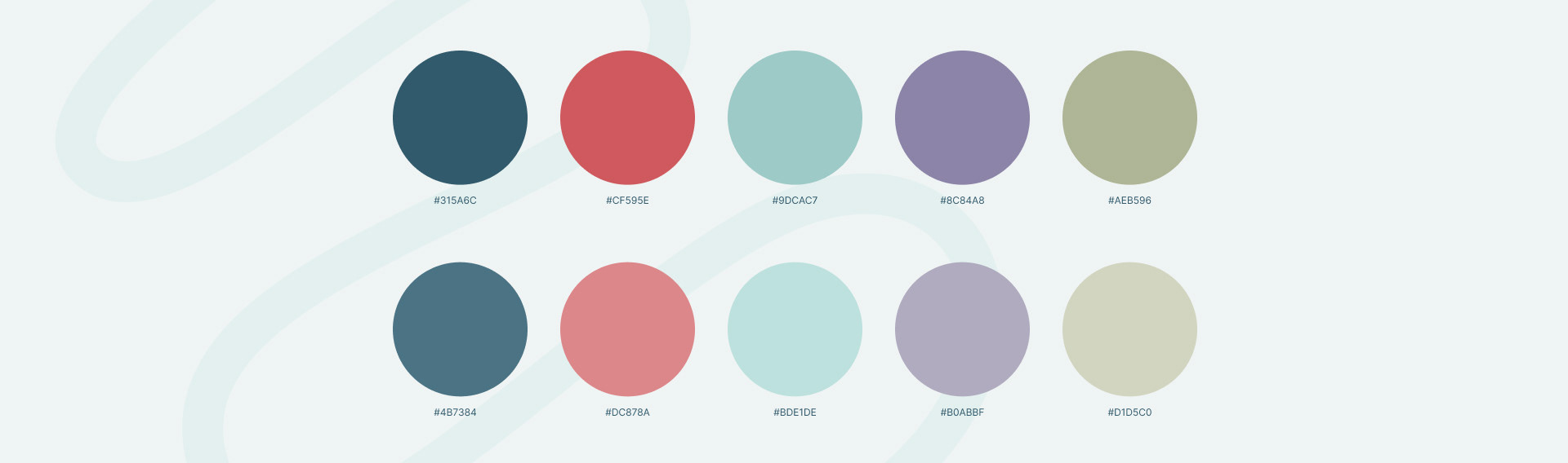
Colour was deliberately kept warm and gentle, moving away from some of the more clinical associations often found within health and nutrition brands. The palette creates a feeling of calm and reassurance, with enough contrast and variation to keep things feeling fresh.
The logo brings Deborah’s initials into the identity, with the flowing forms connecting back to the wider squiggle device. The hand-drawn quality gives it a sense of individuality, helping the mark feel personal to Deborah.
If you’ve got this far, hopefully you feel like you’ve just been given a comforting hug.